A site that’s mine, not a template
This is my home on the web — where my work, my writing, and the way I think about the craft live together. I designed and built it side by side with Astro Rocket, the open-source Astro 6 starter I released on the same day.
Same starting line, different finish. Astro Rocket is the clean, opinionated theme anyone can clone. This site is what happens after the clone — a place that keeps growing, picks up its own personality, and carries the ideas that wouldn’t make sense in a generic starter.
Astro Rocket is the theme. This is the home it lives in.
Everything Astro Rocket ships, tuned for me
Because this site is built on Astro Rocket, it inherits the whole feature set: the full design system, 57+ components, the 3-state colour-mode picker, native opt-in i18n, the complete SEO stack with JSON-LD and hreflang, Pagefind search, the Resend-powered contact and newsletter forms, Google Consent Mode v2, an auto-generated table of contents on long blog posts, Giscus discussions, independently configured header and footer menus, and a layered animation system that respects reduced motion. Everything is there. I just made different decisions about what to keep visible.
One brand, one colour
Astro Rocket exposes twelve live-switchable colour themes from a pill in the header. On this site, that pill is off. Indigo is the brand, and the surface should reinforce that — not invite visitors to talk me out of it. The theme system underneath is still doing its job; I just locked the dial.
Lighthouse: 100 across the board
This site scores 100 on every Lighthouse category — on both desktop and mobile — Performance, Accessibility, Best Practices, and SEO. Every new feature is weighed against its Lighthouse cost before it ships; the mobile LetterGlitch was on the table for a while, and the 2-point Performance hit it would have cost is exactly why I left it off. For what each score actually measures, see What the Lighthouse Score Actually Means.
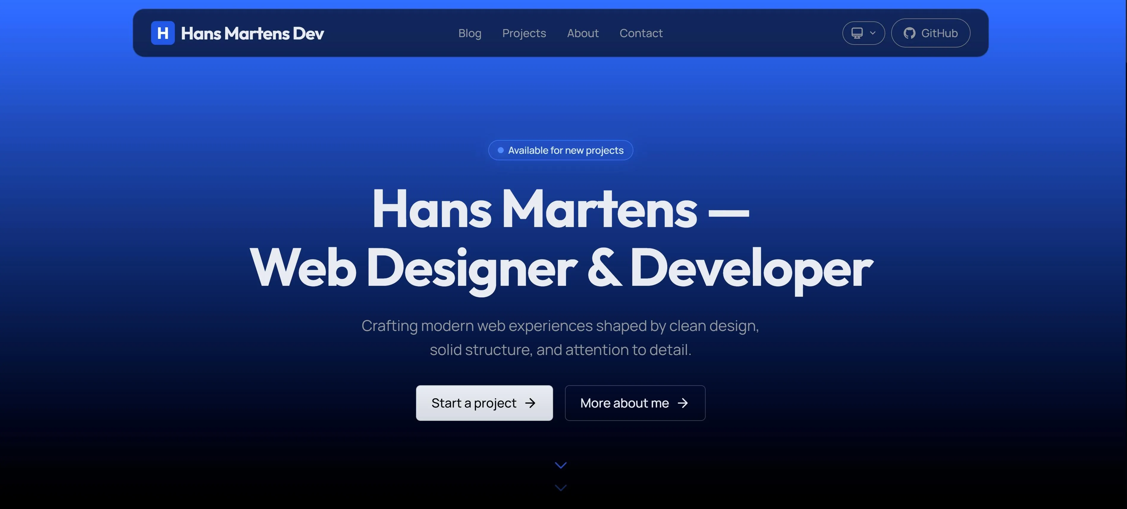
One hero, both modes
The homepage hero is built around a single vertical gradient — brand-indigo at the top, fading to pure black at the bottom — and it renders identically in light and dark mode. The hero is the moment the brand has to land, and locking it to a fixed brand-to-black ramp means the headline reads with the same drama regardless of which mode the visitor’s OS prefers. The headline sits in a slightly dimmed, brand-tinted near-white so it never competes with the gradient, and the floating header rests on top as a frosted capsule. Every inner page — blog, projects, about, contact — drops the decoration entirely and lets the content speak.
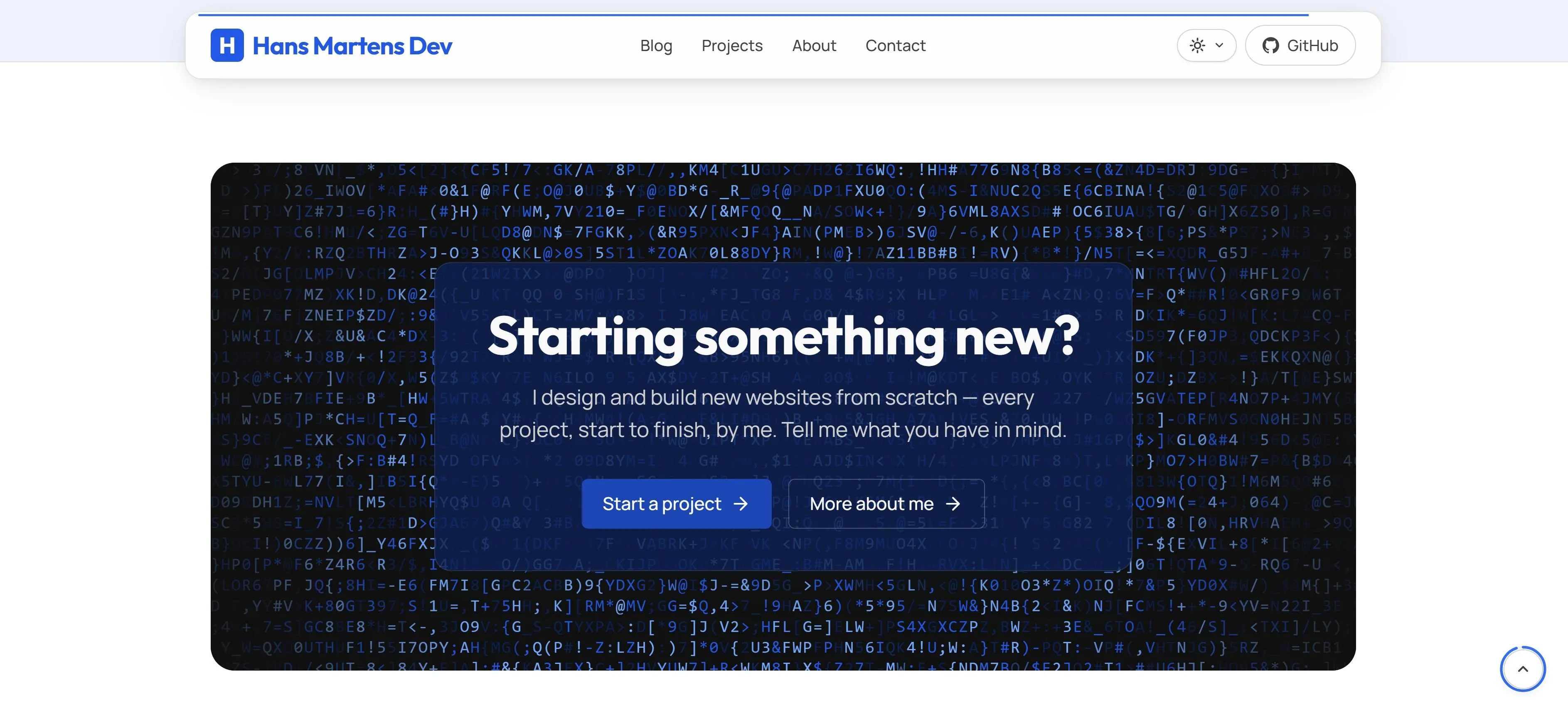
The desktop CTA you keep scrolling back to
The closing call-to-action on the homepage, about page, projects index, and every blog post finishes with the same composition: a contained band with the LetterGlitch canvas cycling brand-indigo letters behind a near-opaque glass card. It’s deliberately desktop-only — on mobile the band would compress badly, so phones get a quieter brand-tinted glass card instead. The full build is written up in Add a LetterGlitch effect to your Astro 6 site.
Small details that compound
-
The cursor leaves a trail. A brand-indigo dot sits exactly under the pointer, a lagging ring chases it with elastic ease and blooms over anything clickable, and a comet of fading particles spawns behind every flick of the mouse. Desktop and fine-pointer only — the moment a visitor sets
prefers-reduced-motion, the whole layer vanishes without a trace. -
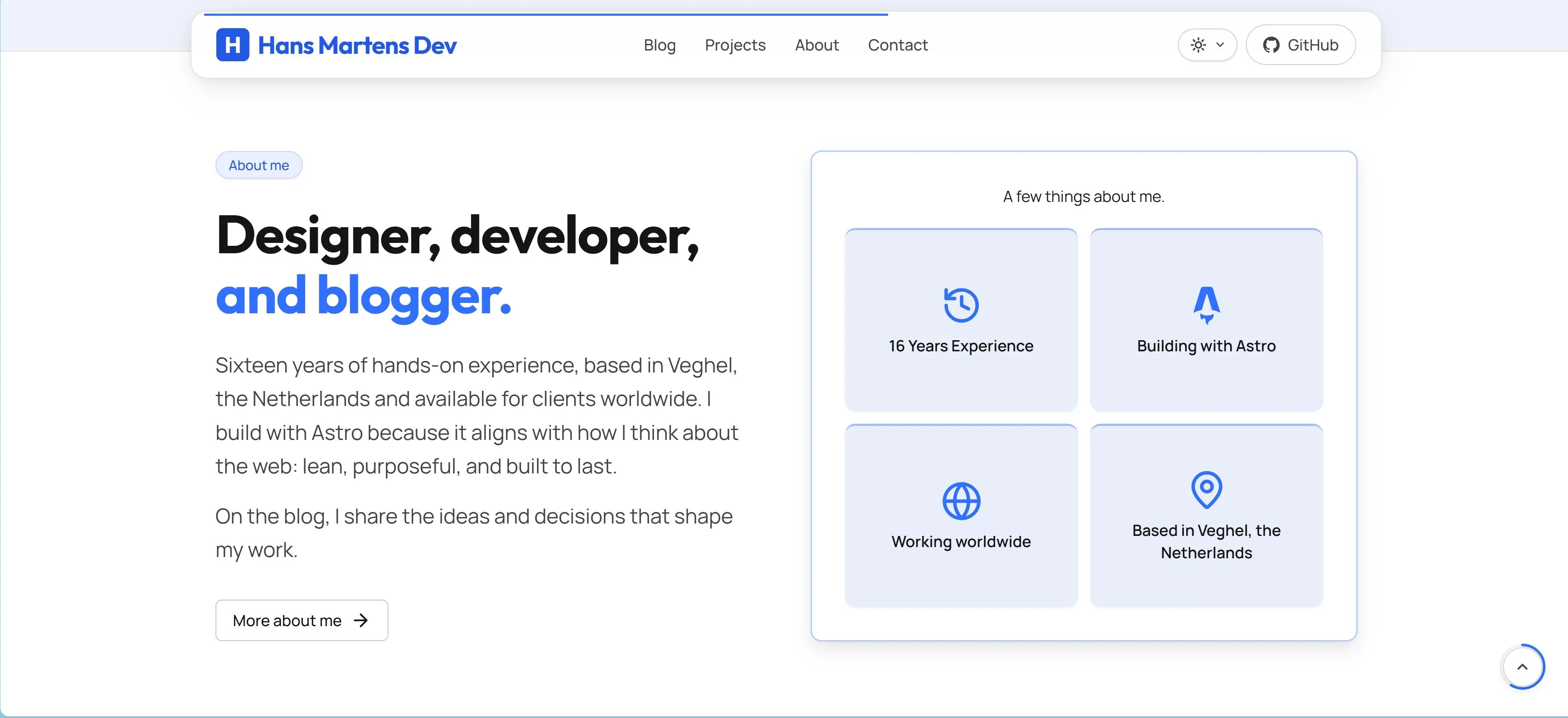
Cards lift, they don’t jump. Every project card, blog card, and about-me tile rises 1px on hover, picks up a softer shadow, and fades in a brand-coloured top-border accent. Small enough that you feel it before you see it — which is the only way a grid should respond.
-
The header flips when you come back. Scroll down and the floating capsule slides up out of sight; scroll back and it returns with its colour scheme inverted to read cleanly against whatever section is now sitting underneath. One 300ms animation does it — menu items, theme pill, and hamburger all ease through together.
-
Scroll progress lives on a ring. A thin arc traces clockwise around the back-to-top button as you read, filling from empty at the top to a full circle at the bottom. Theme-aware,
requestAnimationFrame-throttled, never the centre of attention. -
Things arrive, they don’t stop. Every entrance uses a cubic-bezier with a controlled overshoot, so elements travel a few pixels past their mark and snap back. A physics spring, no runtime library. Reduced motion turns the whole layer off cleanly — no awkward fallback frame.
-
The headline types itself without shifting. The hero word cycles through phrases, but the line width is locked to the longest one before the animation starts — measured from an off-screen clone that inherits the exact computed font metrics. Most typing effects shift their surroundings every cycle; this one doesn’t. It’s the Core Web Vitals detail almost everyone gets wrong.
-
No flash, ever. A small synchronous script in
<head>reads the saved colour mode and applies the right.darkclass before the body paints, so dark-mode visitors never catch a frame of white — across reloads, new tabs, and every internal navigation. The kind of detail no one notices when it works, which is exactly the point. -
System, Light, Dark — a real three-state switch. The colour-mode pill isn’t a binary toggle. You can pin Light or Dark, or pick System and let the OS drive — and when System is active, the page flips live the moment macOS or Windows does, no reload. The icon in the pill always shows what you picked, not what’s currently rendered.
What lands here first
Astro Rocket is published, listed on the official Astro themes directory, and stable. From here on, the new work — features, experiments, writing — lands on this site first. Some of it gets folded back into the starter. Some of it stays here because it only makes sense in context. Either way, this is where the next thing shows up.