Table of contents Show Hide
What it is
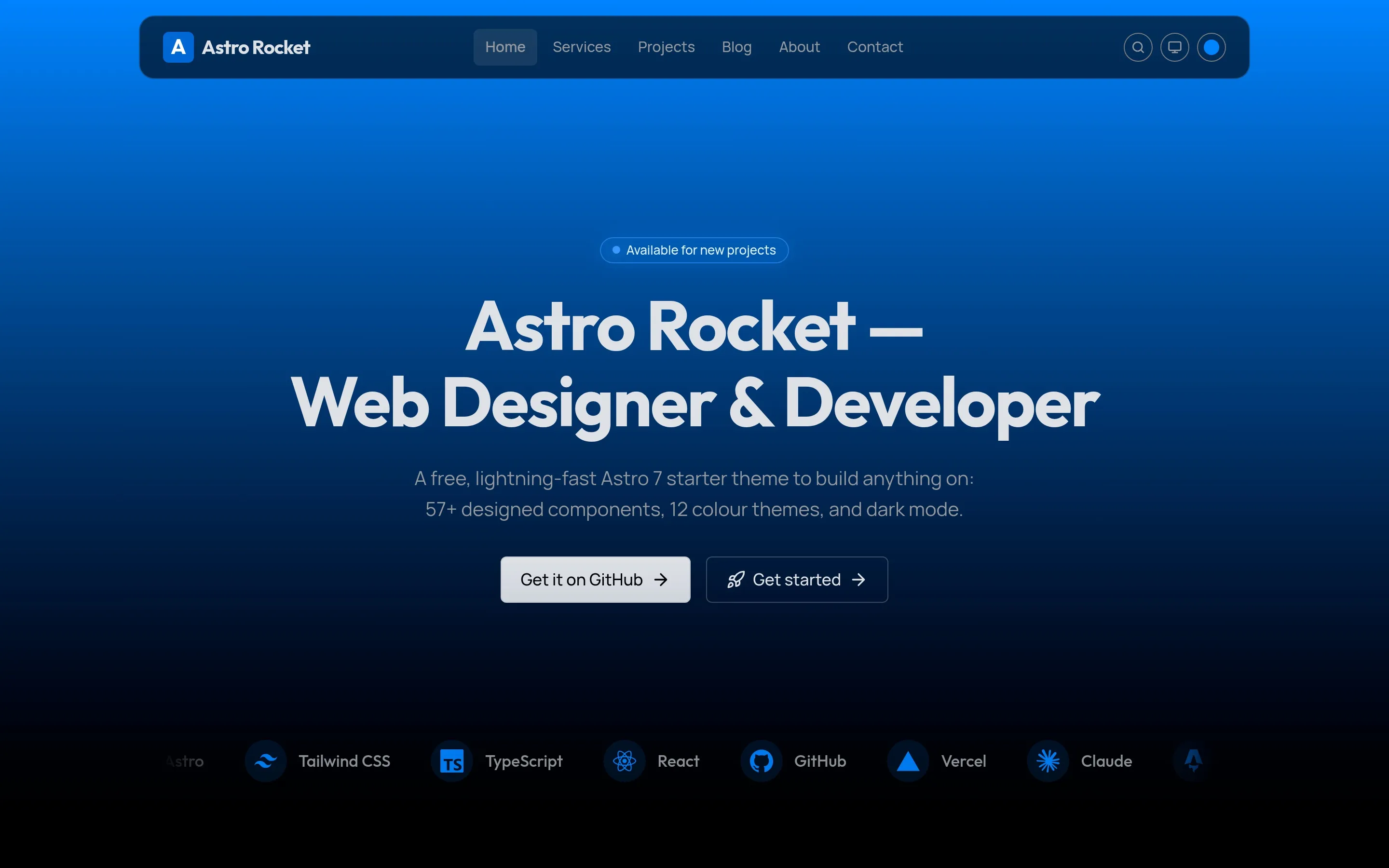
Astro Rocket is my own free, open-source theme, built on Astro 7 and Tailwind CSS v4. It isn’t a boilerplate you spend a week wiring up — it’s a complete foundation built around a component library: 57 designed, accessible components that all speak one design language, so whatever you build with them looks right.
I made it for the people I know best: designers, freelancers, and developers who want to build a beautiful website without starting from zero. It’s MIT-licensed, up on GitHub, and listed on the official Astro themes directory. The full thing runs live at astrorocket.dev.
Lighthouse score result
The whole point was a theme that scores 100 on all four Lighthouse categories — Performance, Accessibility, Best Practices, and SEO — out of the box, on both mobile and desktop. And not on a stripped-back demo page: the full site, with the animations, the theme switcher, the typed headline, and the contact form all running.
That score isn’t something I bolt on at the end. It comes from Astro shipping zero JavaScript by default and me refusing to undo that. If you want the plain-language version of what the four numbers mean, I wrote it up in the Lighthouse post.
Twelve themes, one click
Astro Rocket ships twelve colour themes — Orange, Amber, Lime, Emerald, Teal, Cyan, Sky, Blue, Indigo, Violet, Purple, and Magenta. They sit as swatches in the header: click one and every brand colour on the page — buttons, links, the auto-generated logo badge, the blog-cover gradients — updates live, no rebuild. Blue is the default. Once you’ve settled on a colour, you can pull the selector out of the header and keep everything else.
Underneath it’s just CSS custom properties scoped to a data-theme attribute, so the browser does all the work and the server never has to think about it.
System, Light, Dark
Colour mode is a proper three-state control, not an on/off switch. You can pin Light or Dark, or choose System and let the visitor’s own machine decide — and under System it tracks the OS setting live, flipping the moment the OS does. The choice is saved between visits, and a small script runs in the page head before the first paint, so there’s never a flash of the wrong mode.
The heroes
The heroes are the part I’m happiest with, and they behave differently depending on the page:
- The homepage hero is a single vertical gradient — the brand colour at the top, fading down to black. It looks the same in light and dark mode on purpose. The first screen is where the brand has to land, so I didn’t want the visitor’s OS quietly changing its mood. The headline types itself, and the line is measured up front so the layout never shifts while it does.
- The inner pages — services, projects, blog, contact — share a quieter hero that flips with the colour mode. In light mode it’s a faint architectural line grid, like pale blueprint paper, brightest under the header and fading out to the page edges. In dark mode that grid gives way to a soft beam of brand light spilling down from beneath the header. Both are pure CSS — no JavaScript, and nothing for Lighthouse to pay for.
What’s in the box
The heart of the project is the component library — 57 components (33 UI, plus blog, landing, layout, pattern, and SEO pieces), every one typed with TypeScript, dark-mode aware, and built on a three-tier design-token system. Around that, the things a real portfolio or marketing site needs are already wired up:
- A full MDX blog with tags, RSS, an optional table of contents, and optional comments via Giscus or Cusdis
- The complete SEO layer — JSON-LD, sitemap, robots, Open Graph, and a ready-made social image
- A working contact form and newsletter, both powered by Resend
- Pagefind static search, and 350+ Lucide plus 3,000+ Simple Icons through a single
Iconcomponent - Native, opt-in i18n — English and Dutch in the box, off until you want it
- A layered animation system — scroll reveals, a scroll-reactive header, animated counters, the typed headline — all of it respecting reduced motion
- Deploy configs for Vercel, Netlify, and Cloudflare, ready to push
Where it came from
Astro Rocket started as a fork of Velocity by Southwell Media — a strong Astro boilerplate with a serious design system underneath it, and full credit to them for that foundation. On top of that fork I set out to build my own website, hansmartens.dev — and before that site was even finished, I realised what I was building could be useful to more people than me. So I released a version of it, with demo content, as a theme of its own. From that point the website and the theme evolved side by side, each improvement in one flowing into the other.
And since the release, the theme hasn’t grown alone. Users open issues with enhancement ideas and bug reports, improvements ship within days with contributors credited in the commits — and the built-in i18n in particular has evolved through those conversations into one of the theme’s most complete features. What started as a fork is now its own theme — a complete foundation to build anything on. Use all of it or only the parts you need: the website you build on it is yours.
Free, and on GitHub
This is the starting point I wish I’d had — already at 100 across the board, with the patterns I actually use built in. It’s free, it’s on GitHub, and if it saves you a week of setup, a star is the nicest way to say thanks.